

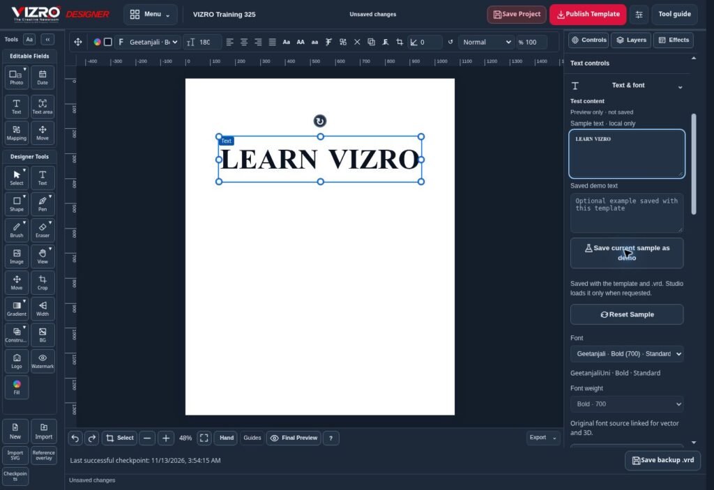
Typography does more than give a graphic its style. It tells the reader where to begin and which details matter. A design with several attractive fonts can still be difficult to understand if every line competes for attention. VIZRO Designer provides text controls that help creators build a deliberate visual order.
Decide what the reader should notice first
Choose the main message before adjusting the font. A headline should communicate the subject, while the supporting text explains the detail. Use differences in size, weight and spacing to establish that relationship.
Avoid giving a date, slogan, headline and contact line the same visual strength. The design should guide the eye through the information in a useful order, especially when viewed on a phone.
Choose fonts that support the actual language
Use an appropriate font for the text you will publish. VIZRO supports Assamese and English workflows, and the intended font must display the characters correctly. Test real words and sentences instead of judging the layout only with short English sample text.
Check spelling, joined characters, punctuation and line breaks carefully. A font choice does not correct the language automatically. For multilingual graphics, review every version with someone who understands the wording.
Use only fonts and other assets you are entitled to use. When reopening an editable project on another device, confirm that the intended fonts and weights are available before exporting.
Give text room to breathe
Leave enough space around the headline and between information groups. Keep text away from busy parts of a photograph where possible. If the background is complex, consider a simpler text area or a suitable contrast treatment.
Do not solve every fitting problem by making the font smaller. Edit unnecessary words, choose a different line break or revise the composition. A readable shorter headline is often more effective than a sentence squeezed into an unsuitable space.
Test a template with realistic variations
For a reusable VIZRO template, try short and long headlines before publishing. Map the fields contributors need and check the result in Studio. Make sure the expected copy fits without clipping or hiding important parts of the photograph.
Review the complete graphic at a realistic viewing size, then inspect the exported file. Confirm the wording, font weight, alignment and contrast. Save the editable .vrd source for later layout changes.
Good typography is a practical service to the reader. A clear hierarchy and careful final check help social posts, business announcements, event posters and news graphics communicate with less effort.
